COLOURS


We have looked at the vibration of sounds through the singing bowls, the vibration of aromas through smells of rose, orange and geranium but what about the vibration of colours and how does that affect us in our own environments?
In order to sustain some kind of balance in our lives the use of colour is also essential. I go in and out of cities all over the world but one place strikes me so full of black, brown, grey and dark blue and that is London. I see few brighter colours floating around and the atmosphere can be quite heavy.
That is why incorporating a healthy selection of colours into your home, workplace are essential as we can see how Google in their head office considers creative colours an essential ingredient to the creativity of their designers.
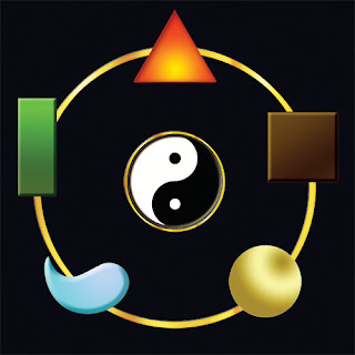
So Red is the colour of dynamism and its frequency can be fast but it is a colour used in all cultures because of it’s connection to vibrancy and good luck. Red is the colour of the fire element when we look at the elemental system in Feng Shui. It is the colour that ignites so if you need a lot of energy it is ideal to bring it into your space whether through flowers, pictures, cushions or even on the walls and can be ideal in the bedroom for passion.

Orange is the colour of grounding, its pulling you towards the Earth and is excellent for the stomach area and self esteem hence the reason for the Buddhist clothing being Orange. Good for the Kitchen because of its interaction with the stomach and appetite.
Yellow is another grounding colour associated with earth; excellent for creativity and for being in the Now especially for children so this would be ideal for the nursery or children’s bedrooms.
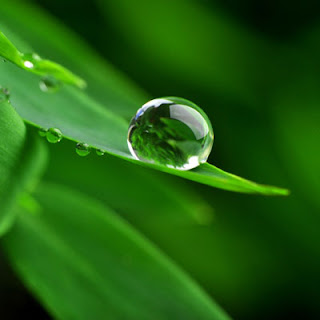
Green is a frequency that is much slower than red making it more relaxing. Excellent colour for your sacred space, to retreat to and is the colour of the Wood Element. Green is all about growth, health and good fortune; paper comes from wood and money is associated with that.

Blue is softer in frequency-it is flowing and slowing us down and is associated with the Water Element. Great for communication, wealth, calming scenarios and this can be manifested and found in pictures, frames, curtains, blue glassware and glass beads.
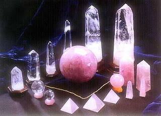
Purple is the divinity and is transcendent – this can be brought in to create a spiritual essence through curtains, vases, flowers, pictures, upholstery. It provides a feeling of security and seems to take us into another dimension of the invisible. Great for your meditation room.

White is the colour of Metal and the element is about shining, reflective, transformative. Often reflected in mirrors and its frames, crystals hanging, gemstones epitomised in pictures, artwork and furniture. Textures, colours, or wallpaper.

So, now you are armed with what colours can do for you and shift the elements within you to create balance or for whatever energy you wish to attract into your home. If you need some assistance with the colours in your own home feel free to visit me on www.wealthyspaces.com